Fulbright project: Dynamic Information Visualization
As a visiting Fulbright scholar at USC in Los Angeles, I am going to explore the potential of interactive and animated information visualization.
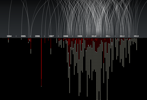
An example of an animated and interactive data visualization, showing every known drone strike in Pakistan, and number of victims. By Pitch Interctive. See http://drones.pitchinteractive.com
It is widely acknowledged that visual representation of information can be highly effective in presenting complex data. Graphical presentation of information enables users to compare data and discover trends, patterns and differences that otherwise would be inaccessible or hard to recognize. However, there has not been much research on interactive data visualization from a design perspective. These are some of the questions I am interested in:
- How may designers approach and work with complex data?
- How may designers understand and handle the tension between data/exploration and narrative/story in dynamic infoviz?
- How can we understand these visualizations as not just ‘neutral presentations of data’, but as meaningful and persuasive design objects?
- How may data visualization move beyond flat, two-dimensional screen displays?
So, what am I going to do?
The project is fairly open ended in terms of deliverables. The plan is to carry out several design experiments with real data, and document and analyze the result. For inspiration, I find it interesting to look to science fiction movies, as they often present novel interfaces for data visualization (even though many of them would not work well as tools for data exploration). What would happen if we used AR or holograms for data visualization?
An additional aim is to enhance my programming skills, which will be necessary for working directly with the material at hand (interaction with data), and for creating working prototypes. So I suppose I will spend quite some time at Codeacademy. Further, I will use gigamapping as a technique for understanding and working with complex data.
I am currently in the process of discussing opportunities for collaborative projects at USC. In addition, I have already an agreement with Difi (The Norwegian Agency for Public Management and eGovernment) to work with data from their large Citizen Survey (Innbyggerundersøkelsen). More on that later.
I am also open for other cases, so feel free to contact me or suggest data that you think should be presented to the world in a visual and engaging form!
1 Comment to Fulbright project: Dynamic Information Visualization
[…] of the goals for my Fulbright project has been to work with real data, and use visualization as a means of exploring, understanding and […]
Leave a comment
Search
Recent posts
- SpotTrack: Award for Design Excellence
- VizBox Bergen og årets geogründer
- Fulbright report: six months at the School of Cinematic Arts in Los Angeles
- The VizBox Experiments
- TopoBox: exploring a tangible dataviz platform
- Norway in 3D part I: from DEM to 3D surface
- Using visualization for understanding survey data
- Story kicking big data
- Fulbright project: Dynamic Information Visualization
- Visiting Fulbright scholar at USC in Los Angeles
- (E)motional design paper at DANDE2012
- 3,5 års arbeid på 6 minutt og 40 sekund
- PhD thesis online
- New video: Kinetic Interface Design
- Presentasjon: Skisser utanfor boksen
October 31, 2013